Chesterfield
“Almost the real thing. Almost.”
Episode 03 of Brands That Didn't Make It — a generative AI commercial series that takes brands which failed, folded, or quietly disappeared and asks what their advertising would look like if they relaunched today.
- Brand
- Chesterfield
- Product
- Nicotine candy cigarettes
- Status
- All but gone from the US market
- Campaign line
- Almost the real thing. Almost.
- Format
- 15-shot spec commercial
- Visual system
- Two eras, two LUTs
- Focus
- Directing, not prompting — full coverage and prompt discipline
- Role
- Concept, direction, color science, generation, edit
The brand
Chesterfield was one of the great American cigarette brands, advertised by movie stars through Hollywood's golden age, and now all but gone from the US market. Candy cigarettes went the same way for entirely different reasons.
The problem
A product that cannot be advertised, in a category that no longer legally exists, for a brand whose entire equity is built on an era of glamour that has since been reclassified as a public health disaster.
There is no honest way to sell this straight. Any attempt at conventional product advertising is either illegal, tone deaf, or both.
The idea
Sell the escape, not the product.
Everyone in the film is somewhere they would give anything to leave. The product doesn't taste like relief. It is relief. That reframe is what makes the tagline work as a personality instead of a disclaimer.
Almost the real thing. Almost.
The film
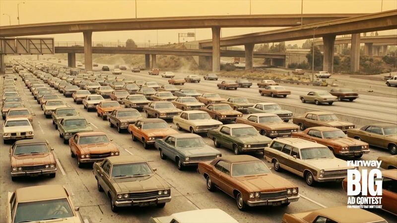
A commuter sits in gridlock in 1974. He bites a candy cigarette and blinks into 1940s Hollywood glamour, still in his car seat, still seatbelted, still wearing his clip-on tie. A beautiful actress is already sitting beside him, as though she had always been there.
They smoke together.
She opens her mouth, and a car horn comes out.
The build
This is the episode where the process stopped feeling like prompting and started feeling like directing.
The concept took five versions to find itself
It started as a candy brand called Coconut Crunch. It became candy cigarettes, then briefly a modern nicotine pouch, then Chesterfield. Paradise was originally a tropical beach and moved to a Hollywood Hills overlook once the black and white era locked in. A seagull got cast, written into the coverage, and then cut when the location changed and it stopped making sense. A cigarette girl character got replaced by the actress who delivers the horn.
The shot count went from 13 to 17 and back down to 15 across five document versions.
That churn is the point. Ideas got chased all the way to their logical conclusion and then abandoned with no sunk cost. A seagull got hired and fired in the same afternoon. That does not happen when a crew is standing on a location with a clock running.
The two-world LUT system
The whole concept lives or dies on the two eras reading as genuinely different films rather than as one film with a filter on it.
World A — 1974. 16mm grain, Kodachrome warmth, the exact texture of a 1970s insurance commercial. Slightly cheap, slightly beige, deeply familiar.
World B — 1940. Classic Hollywood black and white. Deep chiaroscuro, brilliant highlights, the Sunset Boulevard register.
The color science got locked before a single frame was generated. Claude developed the LUT direction for both looks, and the LUTs were imported straight into Premiere for the grade. Deciding the film stock, the decade, and the emotional temperature of each world up front changes how every prompt underneath it gets written. Grade is a pre-production decision here, not a finishing step.
Prompt discipline
The build ran on a strict two-format system.
Image prompts: Subject / Composition / Lighting / Camera / Style.
Video prompts: Scene / Camera Movement / Motion and Action.
Every image prompt has to be completely self-contained, with no reference to any previous shot. The model has no memory of what it generated ten minutes ago. Nearly all drift across a shot list this long comes from prompts that quietly assume continuity the tool cannot provide.
Typography
Didot or Futura for the endcard lockup. Both period-correct for the 1940s world, both able to carry a tagline that is doing a joke and a legal hedge at the same time.
The stack
| Function | Tool |
|---|---|
| Concept, brief, and prompt development | Claude |
| LUT and color direction | Claude, graded in Adobe Premiere |
| Image generation | Google Nano Banana |
| Video generation | Kling |
| Music | Suno |
| Voiceover | ElevenLabs |
What it proves
Three episodes in, the thing that kept surprising me is how much this feels like actual directing rather than prompting.
Full coverage. Every shot accounted for. Transitions, character introductions, and the exact frame where the joke lands, all worked out in the brief before generation started. The absurdity of the ideas is what made it fun. A car horn coming out of a beautiful actress's mouth on the Hollywood Hills in black and white is not an idea that survives a budget meeting.
The tools are the crew. The thinking is still the job.